Call me Victoria!
I'm an Edmonton-based graphic designer and illustrator with a knack for making bright and bold styles. After graduating from the U of A with a game development certificate in 2023, I pursue to study graphic design at MacEwan University to highlight the importance of user experience, digital interaction and visual communication into the ever-changing landscape.Multifaceted in such areas, I apply the passion I have for digital media and visual narrative as the means to help and represent other communities. In a world that can be confusing at times, I'm here to find solutions and make sense of it all—like solving one level at a time in a puzzle game.Let's reach out!
Main Skills
UX/UI
Branding & Visual Identity
Illustration design
Video editing
Motion graphics
Education
UNIVERSITY OF ALBERTA
BA Music major
Art & Design minor
2018 - 2023MACEWAN UNIVERSITY
Bachelor of Design
2023 - 2026
Awards & Certificates
Certificate in Computer Game Development
University of Alberta, 2023
Software Skills

Miscellaneous Skills
Game art
Music composition
3D modelling (cultivating...)
HTML, CSS, Javascript
Social Media Marketing
Research & presentation
Resume
Marketing & Design VP
Arts For YoungSTARS, 2023VP of Social Media
MacEwan Game Development Club, presentMarketing & Design Volunteer
Interactive Arts Alberta, present

Have a question? Let's reach out!
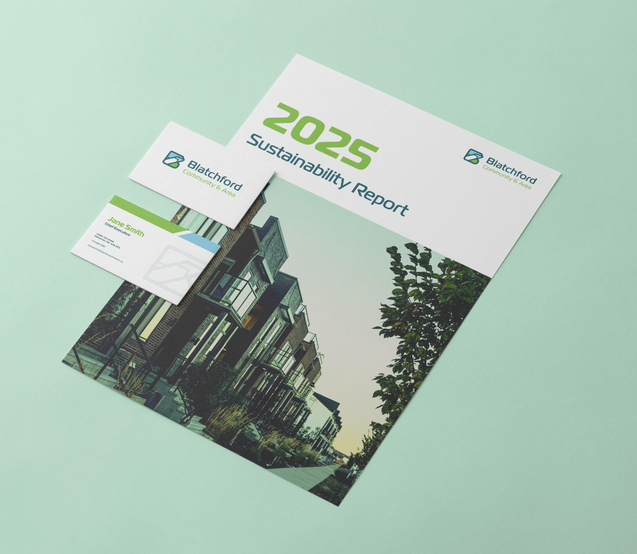
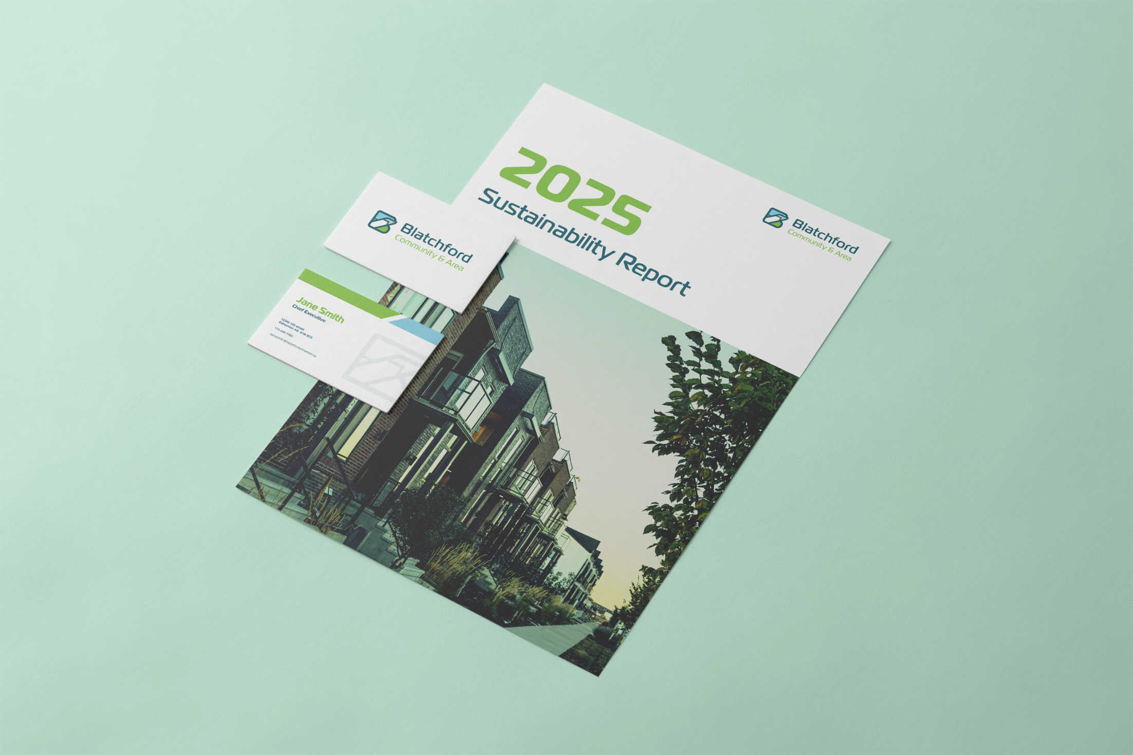
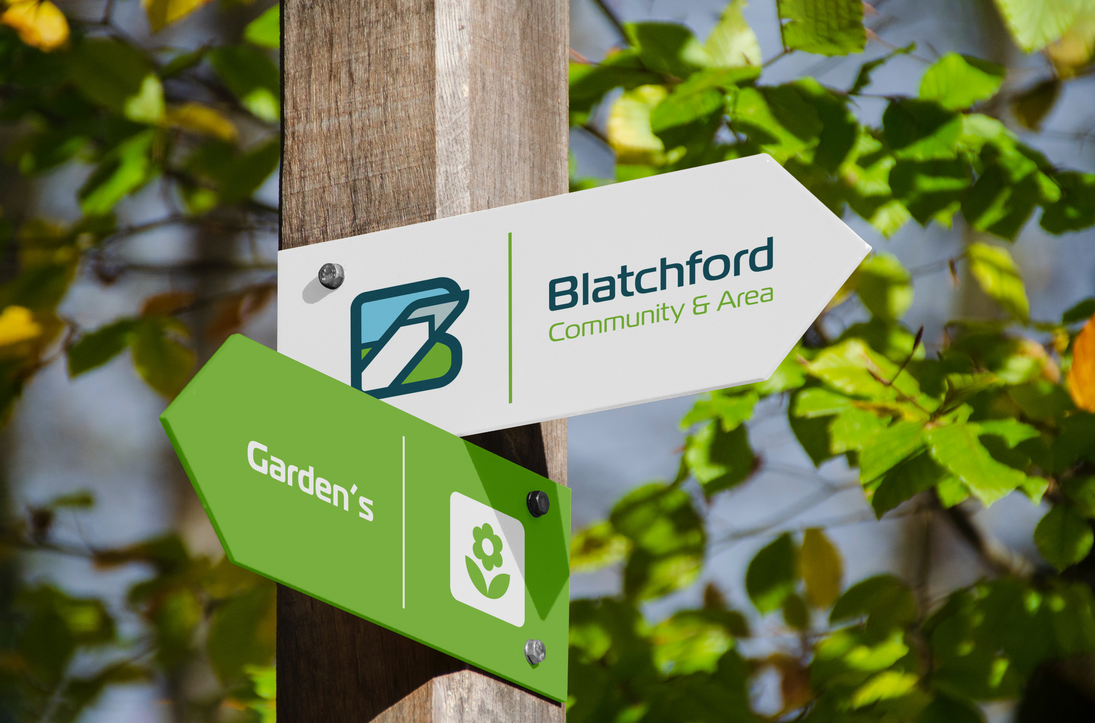
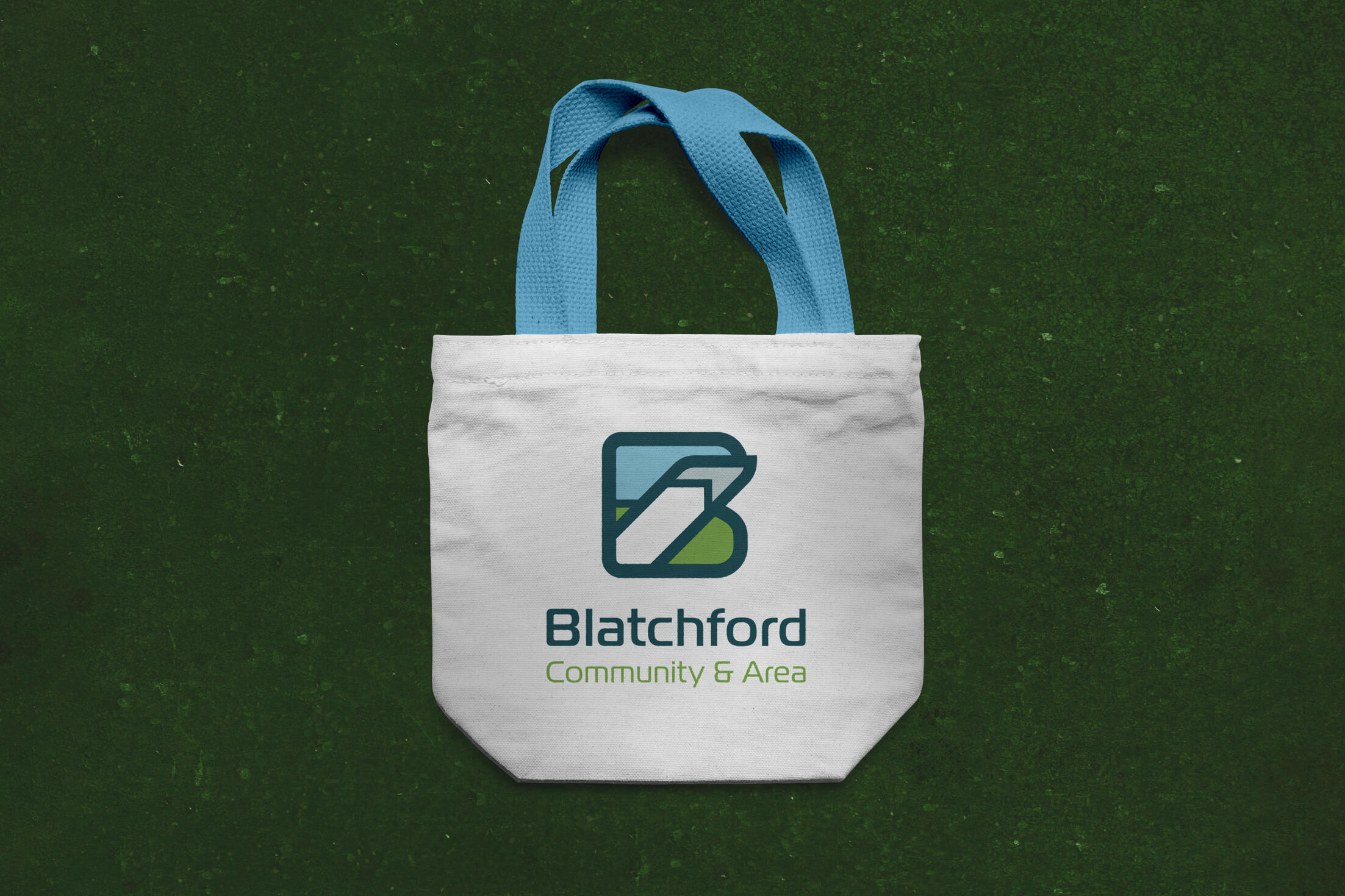
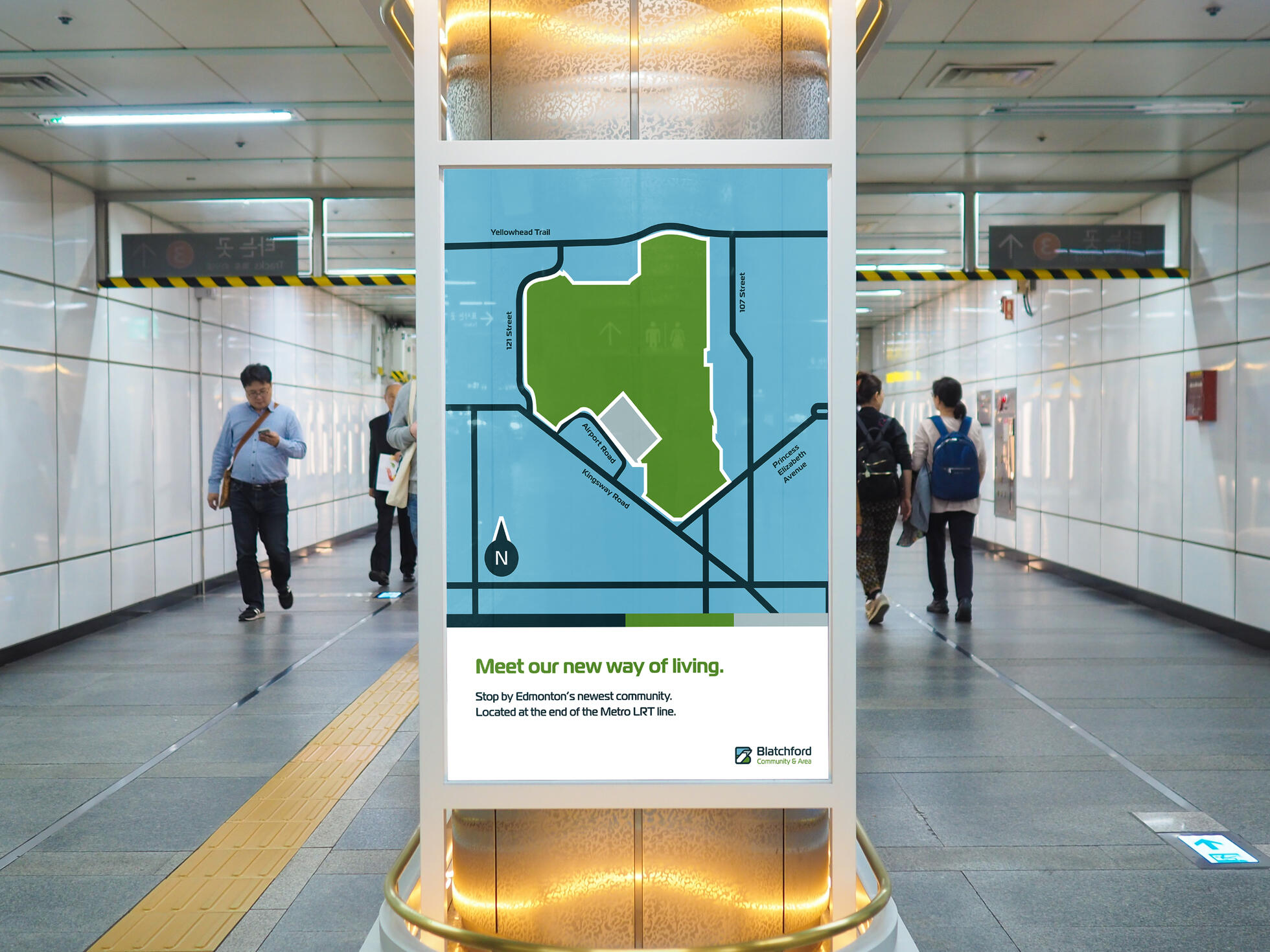
Identity & Branding Design: Blatchford
DESN 311 Corporate Identity Design & Branding - 2025
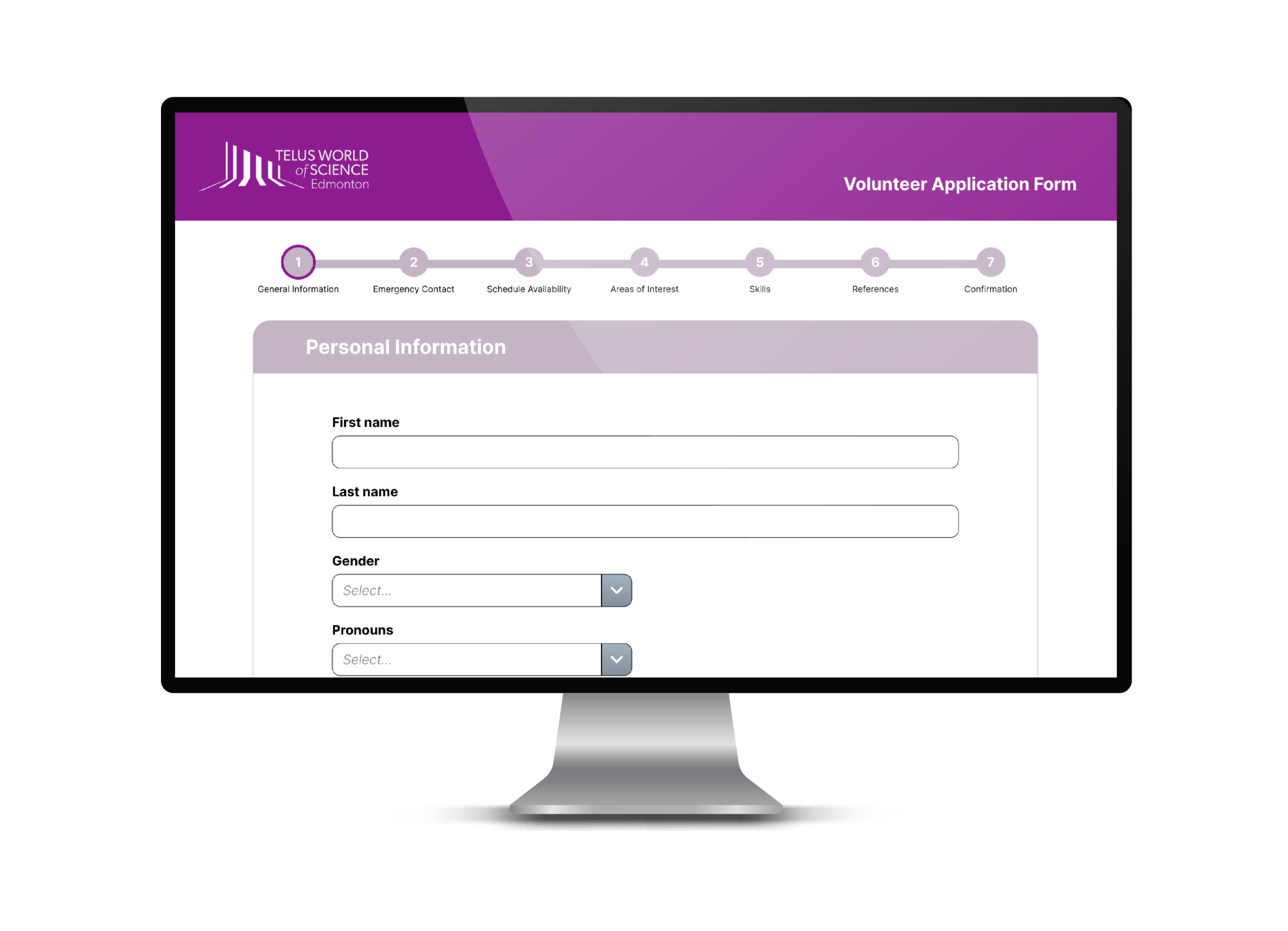
Interaction Design: TWOSE Volunteer Form
DESN 344 Interaction Design - 2025
01. Overview
The Telus World of Science--Edmonton is a non-profit space museum operated under by the Edmonton Space & Science Foundation under sponsorship by Telus communications. As the largest science centre in Western Canada, it offers volunteer opportunities to Edmontonians who wish to educate and promote the public in science and cultural histories of Canada.
02. Problem
Various UX problems in the form include the following:
Scrolling is too large; sections could be broken up into pages in order to give the user a sense of progress as well as to reduce cognitive overload.
User won’t immediately realize that these sections are collapsible, making them redundant and overlooked in the form layout.
Lots of dropdowns are used, making the input fields hard to differentiate with each other (and make it more difficult to fill in certain questions efficiently).
Aligning these fields to the left creates empty space on the right that makes it appear unbalanced to the eye.
Input text fields for paragraph-based answers are too small to write.
03. Design Process
Breaking up the categories into boxes bring clarity to how these text input fields are grouped together.
In the original form, the roles are poorly categorized in such a way that it presents a difficult time for the user to efficiently scan across the page to look at the different roles and options within the areas of interest as well as skills. Instead of laying out the checkmark options horizontally, they only consist of two columns, and are categorized into groups relevant to a substantial list.
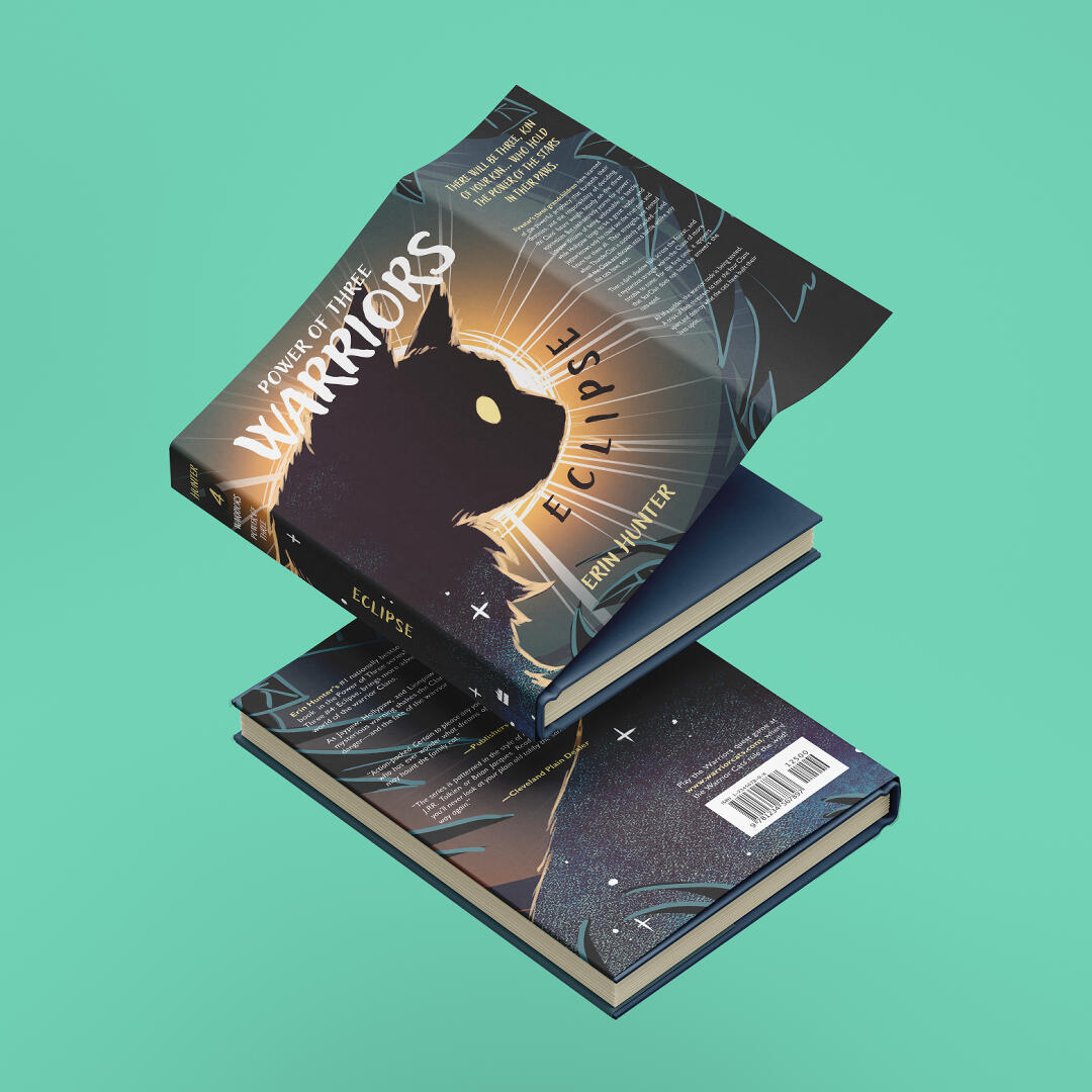
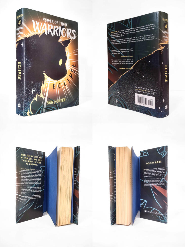
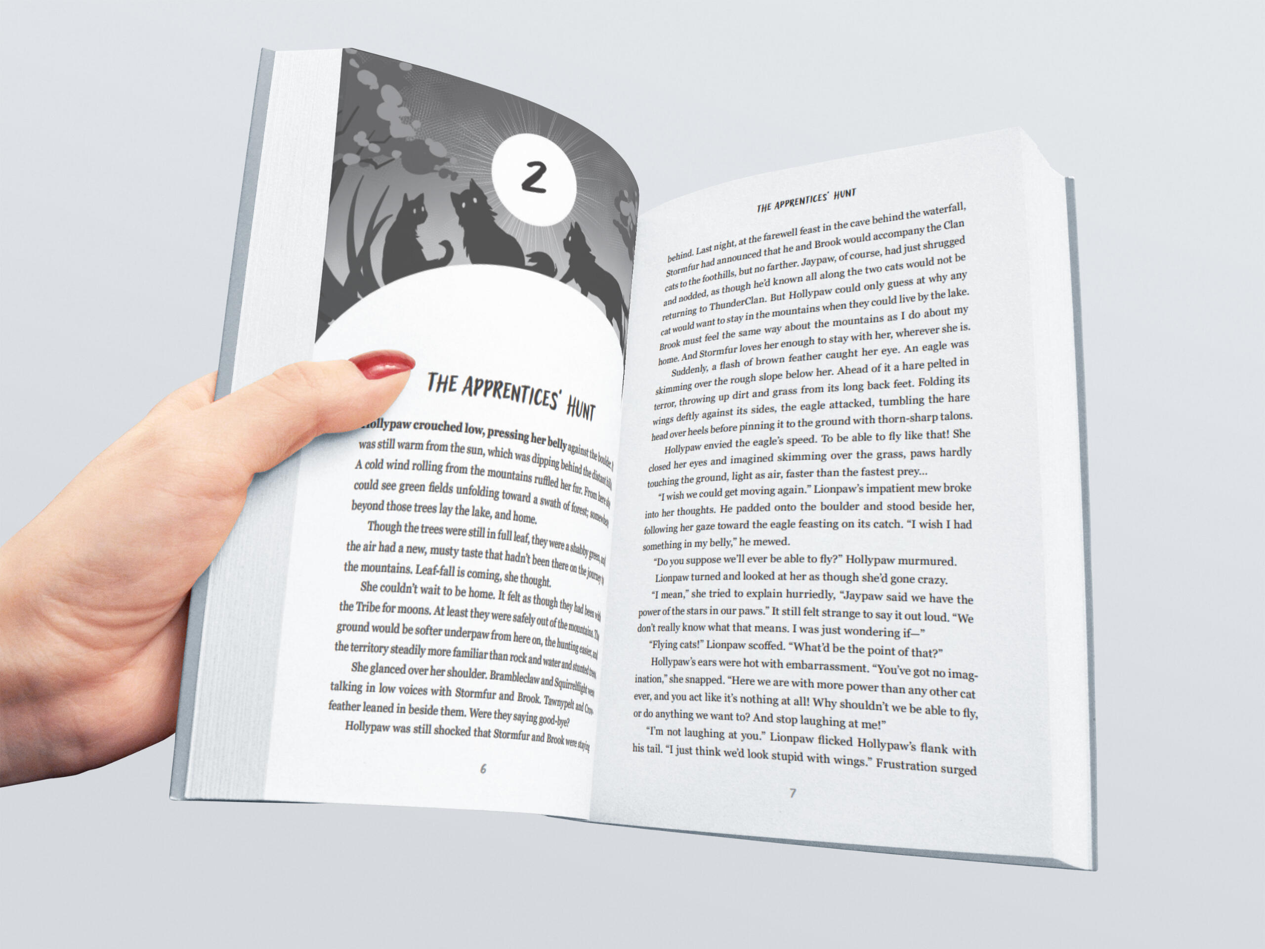
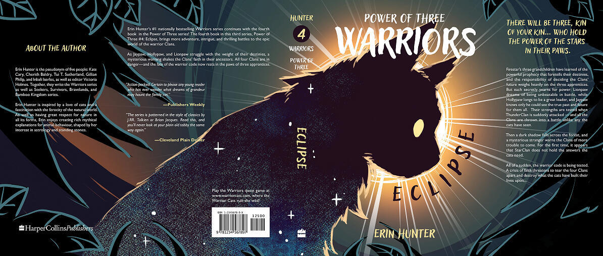
Layout Design: Warrior Cats Book
DESN 131 Typography I - 2024
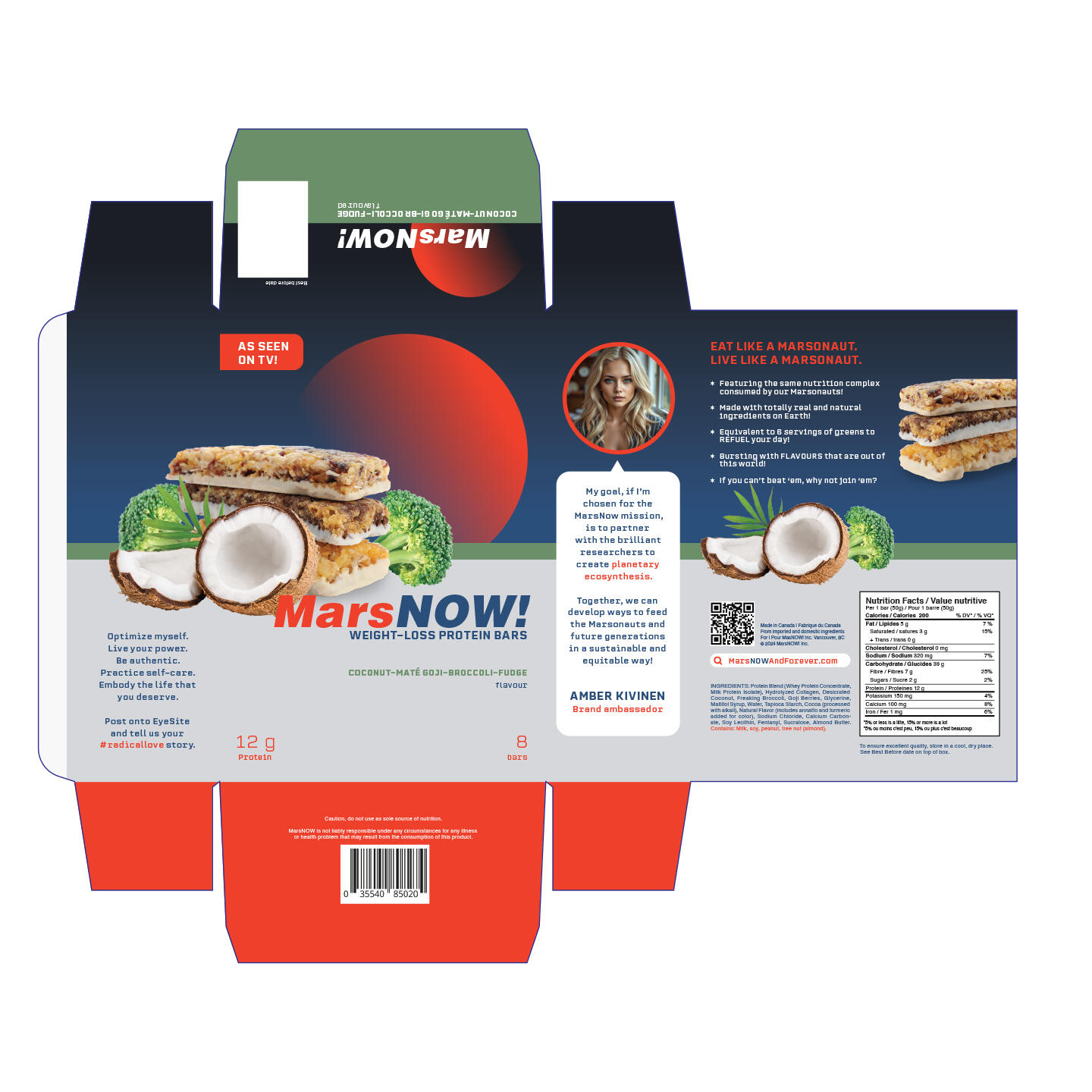
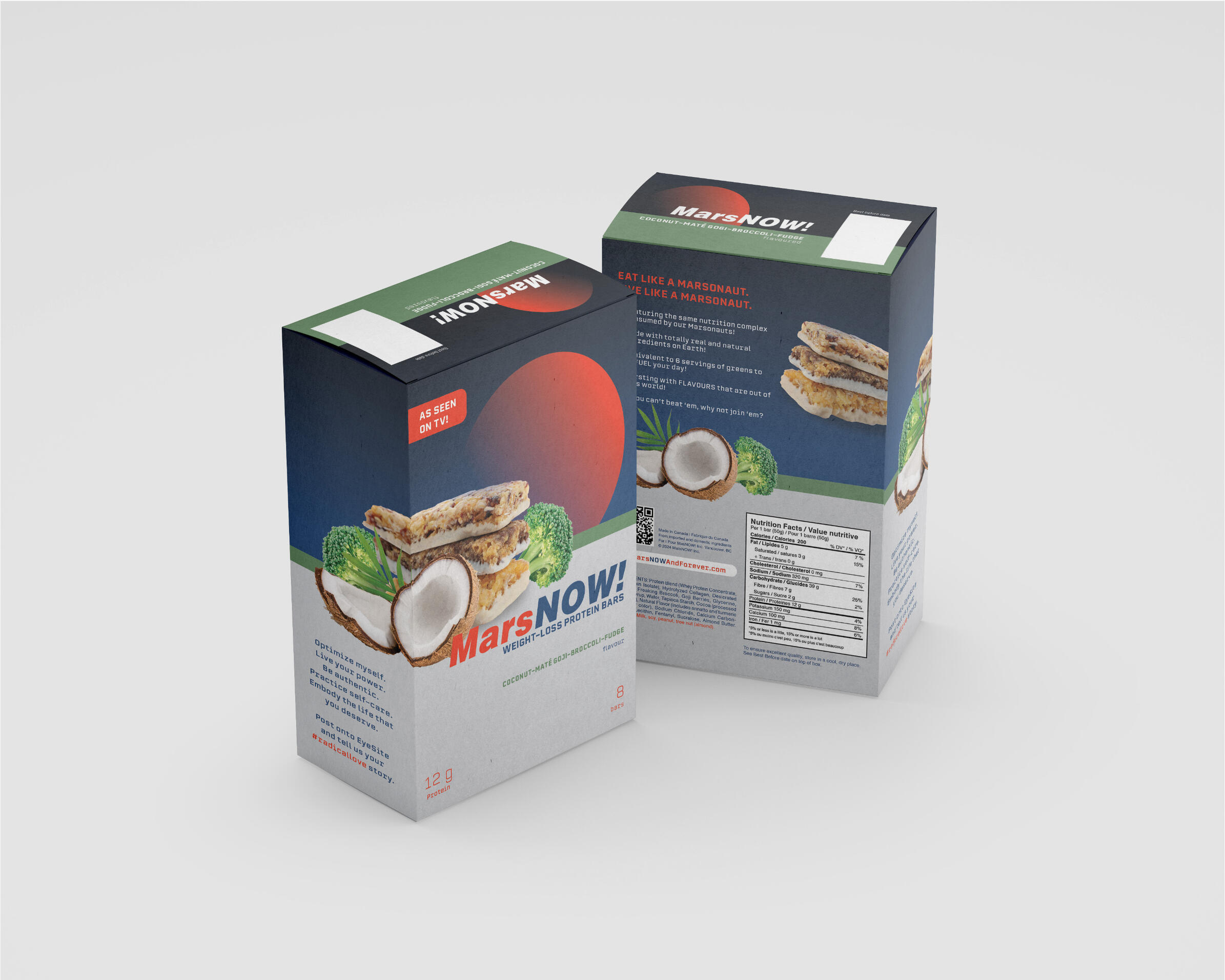
Experiential Design: MarsNow Protein Bar Boxes
DESN 231 Typography II - 2024
Rationale
MarsNOW! Weight-loss Protein Bars is a fictitous food product referring to the space organization’s promotional brand from Deborah Willis’s novel “Girlfriend On Mars”. The box carries an undertone of the book’s satirical themes that deconstructs on short-term gratification, online trends and living in the post-capitalist landscape within contemporary society. These protein bars present themselves as a marketable commodity by which the notion of one purchasing them is a wordplay into the idiom of “buying into“ the trend held by this multimillionaire space corporation. Just as how the book presents MarsNOW as a reality television show that tends to stage various
deceptive and exploitative practices, the packaging also carries its dubious nature by its bizarre flavour, sarcastic lines and a health disclaimer printed in small detail, almost masked away by its commercialized visual branding.
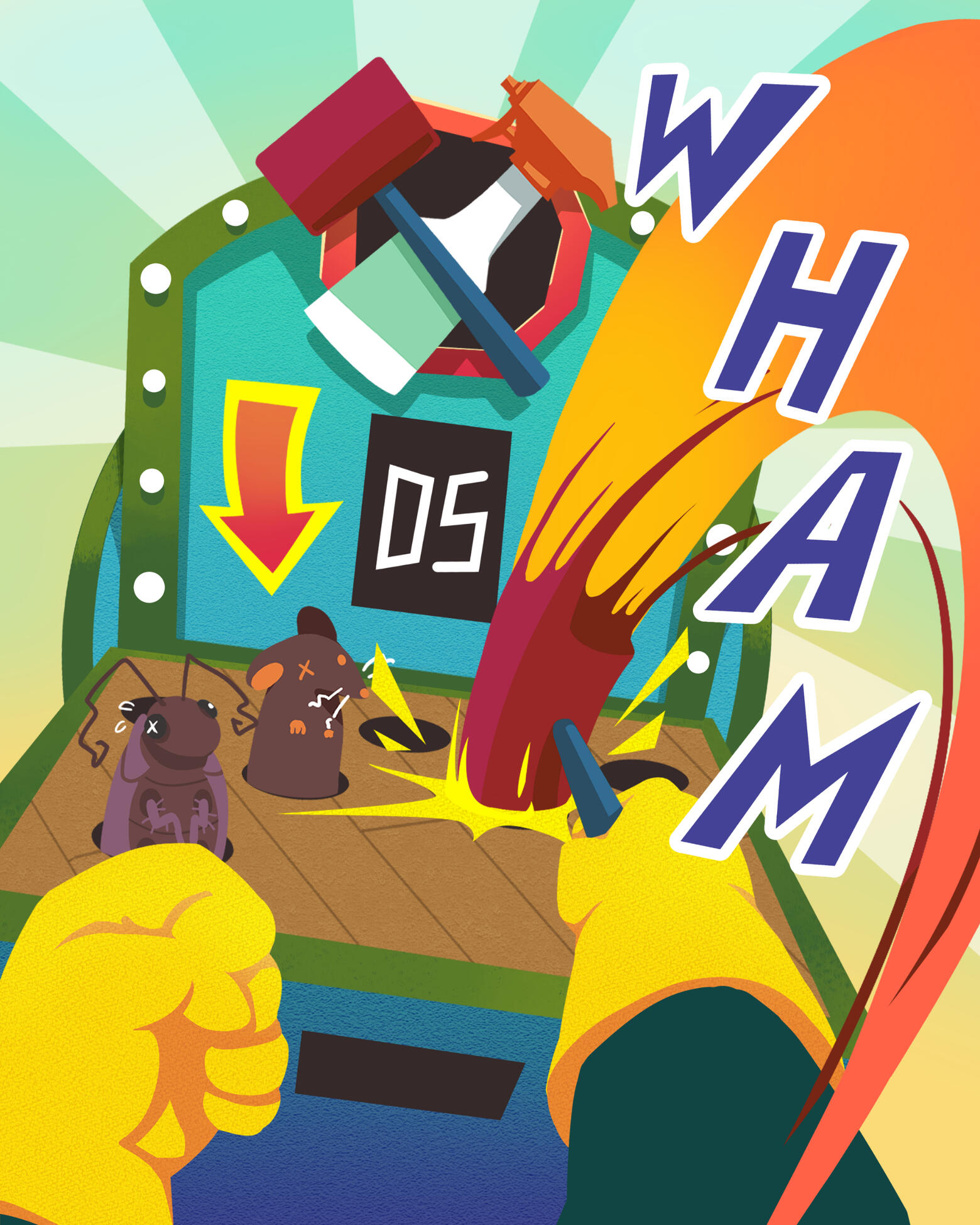
Illustration Gallery
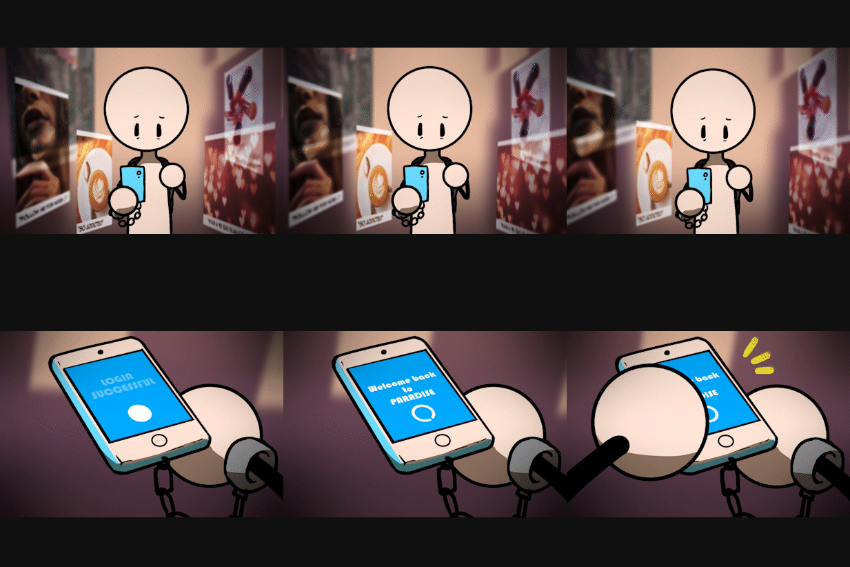
Look On Up
MUSIC 103 video project - 2020
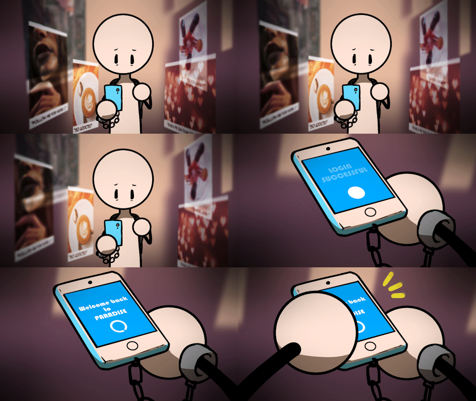
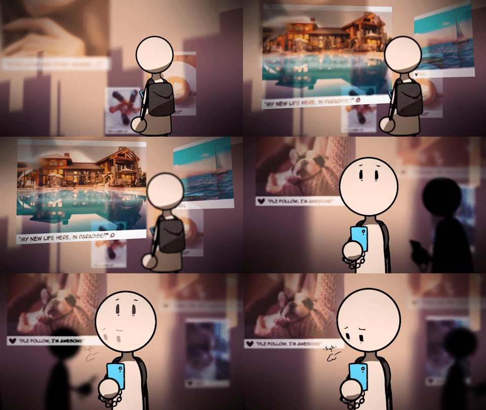
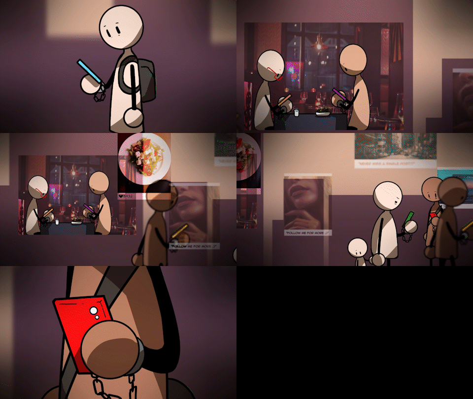
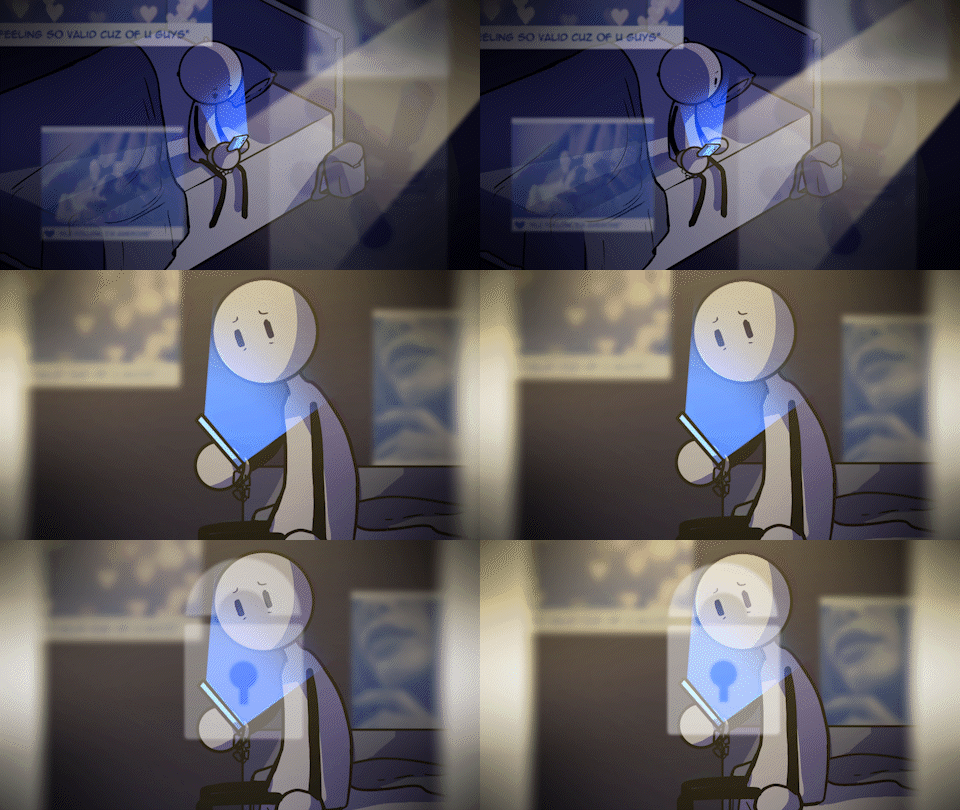
The purpose of this animated video was to enhance the message about social media addiction as conveyed within the lyrics from Relient K's "Look On Up".In addition to exploring keyframe tweening, camera movement, layer masks, composite shots and VFX provided by Hitfilm Pro, I drafted each of the scenes through rough storyboard sketches before producing assets by freehand in Clip Studio Paint.
Promotional Material: MacEwan Game Development Club
MacEwan Game Development Club - 2025
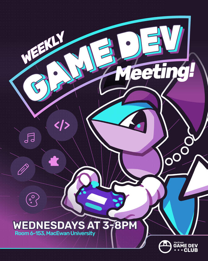
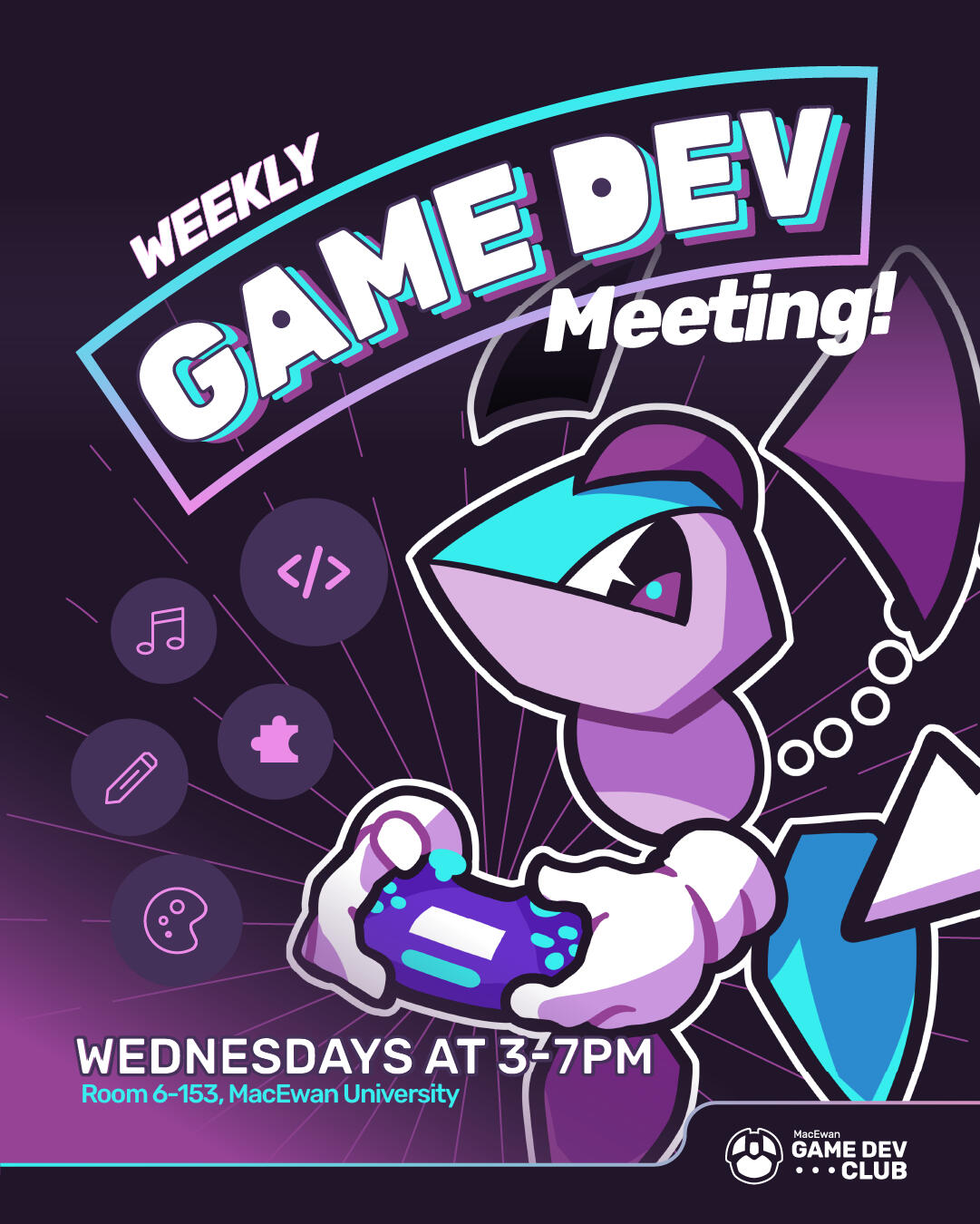
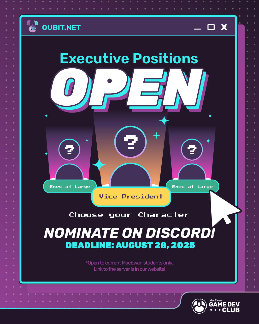
The MacEwan Game Development Club is a student club recently established in 2025 that brings students across disciplines and programs to celebrate game culture and make games. Given its recent establishment, my executive position as a social media VP was not only limited to making promotional content but also with branding the club's identity and structuring its foundation by hosting workshops and events, connecting not only to the school but also to Edmonton's local game development community and beyond.This project is still ongoing.
Spatiality
ART 350 video project - 2023
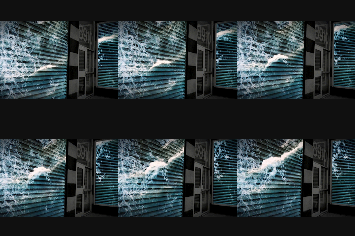
A 2-minute animated digital project for ART 350 at the University of Alberta. Spatiality is a playful experimentation on our understanding of where we stand in space and how more or less we are aware of our own perceptions in different ways.A combination of personal footages of my university campus as well as stock videos and images are combined through masking and camera tracking, and applying other effects such as blur, rate stretch and blending modes achieve a cinematic finish.
Game Art - Within the Vault
INTD 450 Capstone Project - 2023
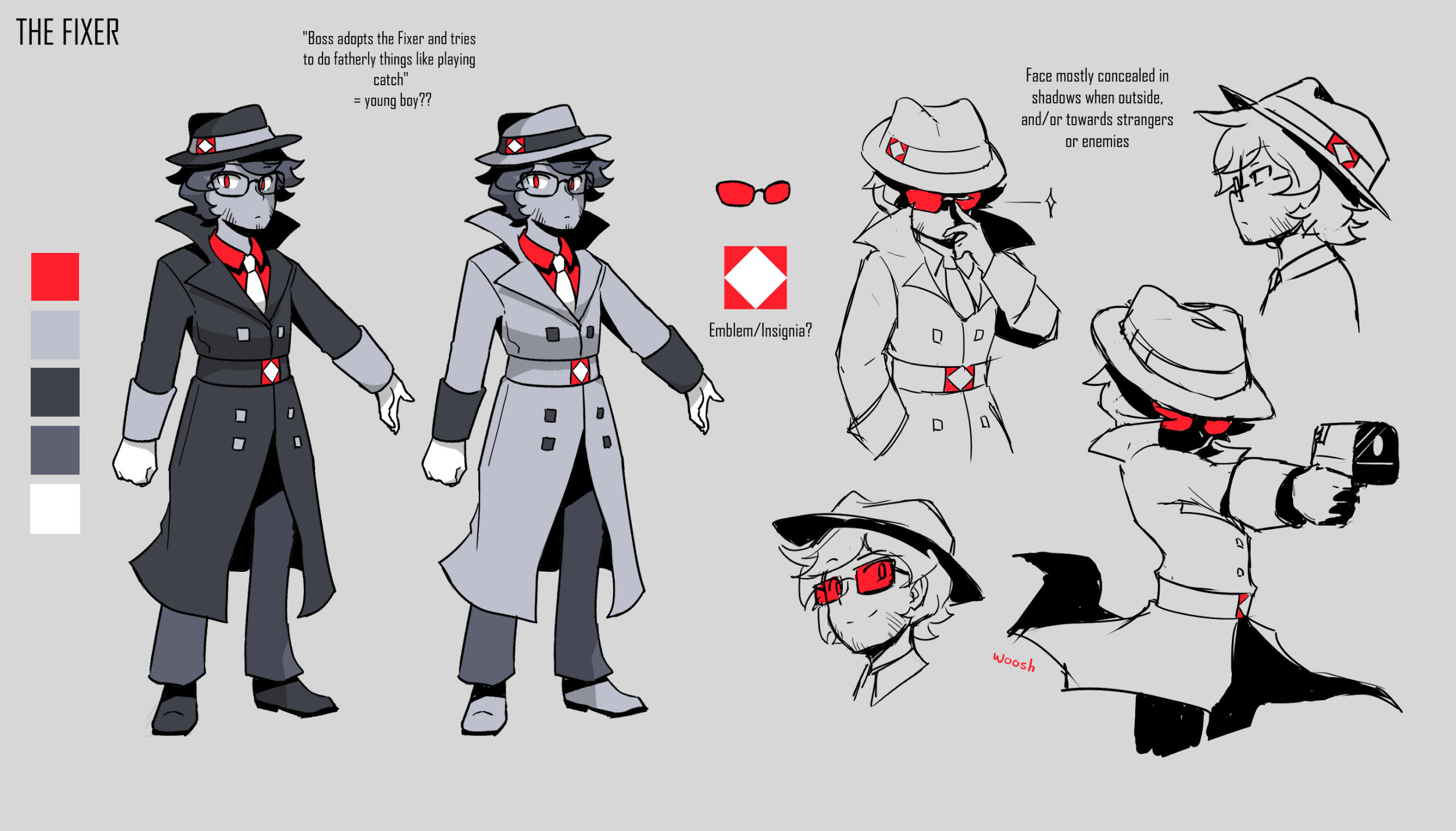
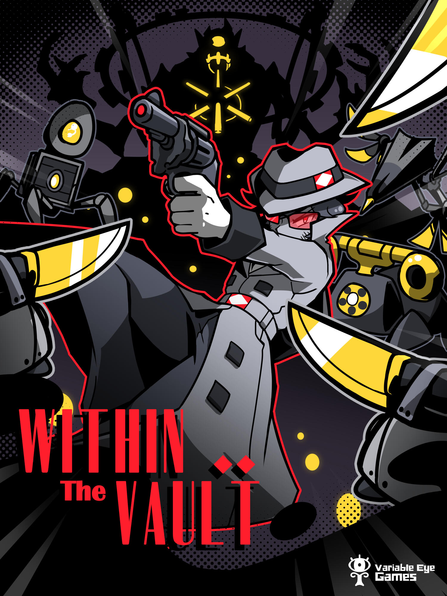
Within the Vault is a 6-person project for the capstone game development course INTD 450 at the University of Alberta. While collaborating with my fellow colleagues, I was primarily responsible for animated sprites, concept designs of the main characters, social media assets, video gameplay trailer as well as all of the musical soundtracks. It was rewarded by the university for "best gameplay", and has been featured in indie game dev exhibitions such as GDX and Game Con Canada.The game is available here to play for the purposes of this portfolio.
